Hello Stampers ~ how do you use Color Coordination in Card Making?
I have had several people contact me and say they really struggle with color coordination when making cards. I know it can be hard to choose the colors you want to use in your crafting. Here are some ideas I use.
If I have to create a card that has a theme ~ ex. Fall, Christmas, etc. ~ I think of colors that go with the theme. For Fall I will look at using green, orange, red, and brown. Some colors that look well together are Old Olive, Pumpkin Pie, Cherry Cobbler, and Early Espresso. For Christmas I will turn to red and green. There are several color combinations that work for this theme ~ Real Red and Garden Green for a classic color combo or Shaded Spruce for a bright color combo. Don’t overlook pink and green such as Blushing Bride and Soft Sea Foam and throw in some silver for an elegant look.
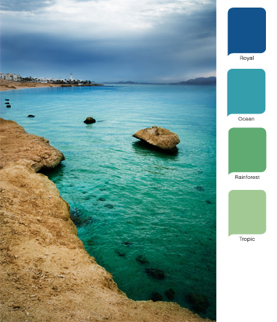
Sometimes I want to use a specific stamp set that may contain a flower. I will google pictures of the flower to see what possible colors you find in nature. Speaking of nature, that is a great way to get color combos. Check out photos and look at the colors you see and use the closest match you can find.

There are some papercrafters whose work I love and often it is the color combination they use. I will check out their cards and choose my color combination from a card they have created.
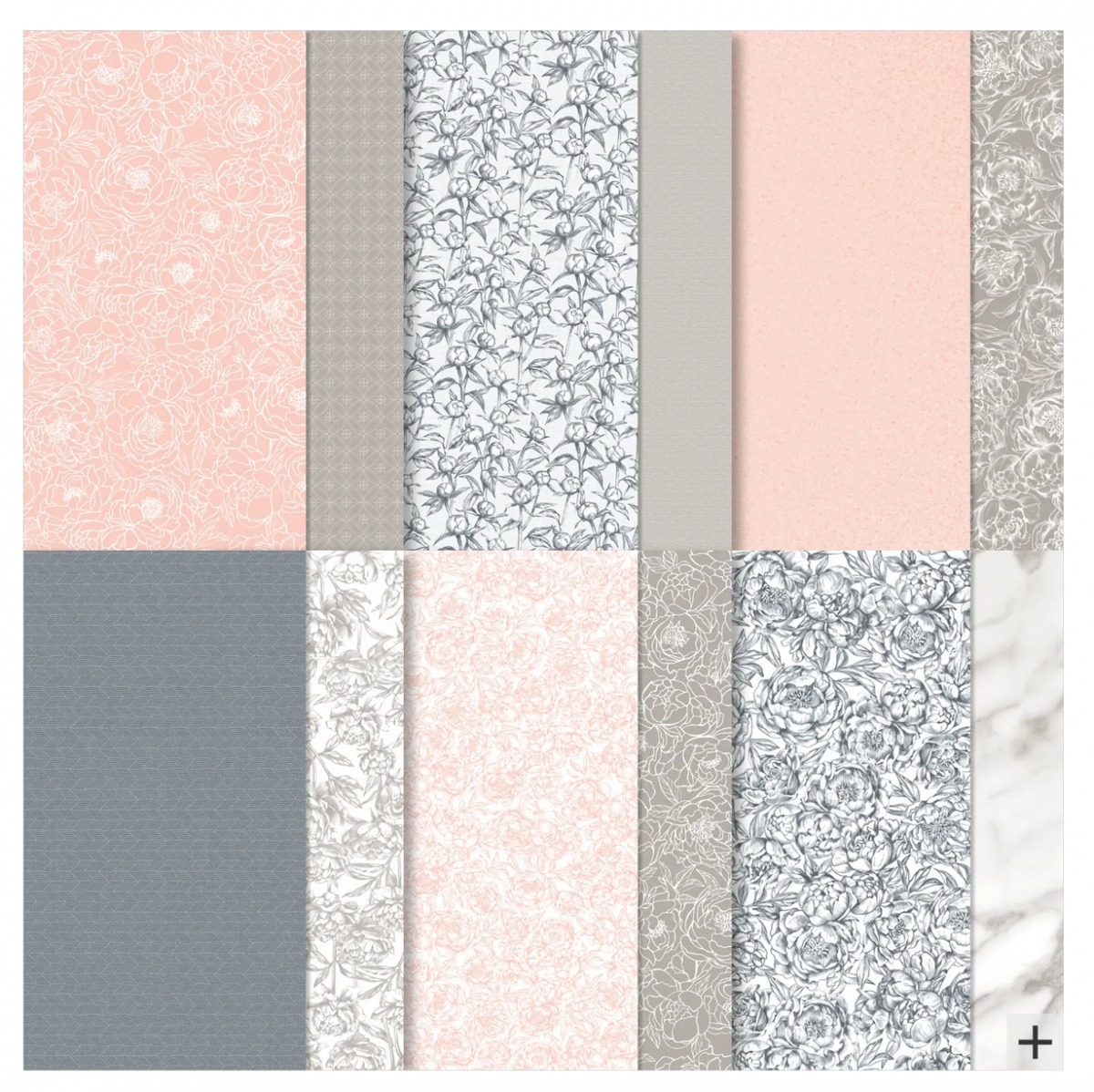
And don’t overlook our designer series paper! The color coordination is already done for you. Choose a piece of designer series paper you just love and then check the back of the package to see what colors were used. Then use those colors on your card.


I hope these ideas are helpful for you. If you have a problem you would like me to share ideas for, please reach out and contact me. I would be glad to help you out. Have a Super Saturday and don’t let Color Coordination in Card Making halt your creative juices!

