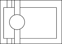
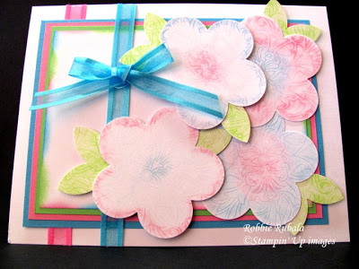
The first card uses an idea I saw on a blog (will edit when I get the info) where they had stamped the Fine Flourish with Versamark and then used a large flower punch template to ink/chalk the shape in the center. They then added the square to their card. I decided to do mine a little differently. I stamped the Fine Flourish with Versamark and then using the large flower punch template I used my chalks to add some color. I then used the large flower punch to punch out my flowers. I ended up adding chalk in 2 ways. The first used chalk all over the shape template. When I do this one again I will make my center smaller and the rest of the flower with be chalked with the other color. After I did these and punched them out I went back and looked at the picture and decided to try again apply chalk just to the edges and center. I think I like this one better. I chose my colors from the color challenge at Stamping 411 blog and the sketch came from the Card Positioning System blog. Here is the sketch and my creation.
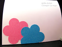
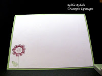
inside of card
Stampin’ Up Supplies
Stamps: Fine Flourish Paper: Green Galore, Pixie Pink, Tempting Turquoise, white Ink: Green Galore, Pixie Pink, Tempting Turquoise, Versamark Accessories: large flower & 5 petal flower punches, chalks, sponge dauber
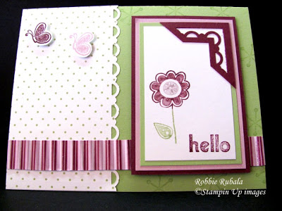
My next card was created using the color challenge at the Diva Coffee Break blog. You were to use Certainly Celery, Pale Plum, and Rich Razzleberry. With these colors I immediately went to my Cottage Wall DS paper. I had the card put together and felt it needed something in the upper right hand corner of the image panel. I saw on one of the many cards I look at someone had used the scallop border punch to create a photo corner. I started playing and while I am not sure this was the same as their corner I like how it turned out. I began with a square that I inserted all the way into the corner punch (this takes some playing with so that you get it in the center) and punched. Next I cut the corner off the square to make a triangle. I then used my paper snips to cut the tent out of the center. After that I felt the upper left corner was bare so I add the 2 butterflies. Here is my finished creation.
inside of card
Stampin’ Up Supplies
Stamps: Hello Again Paper: Certainly Celery, Pale Plum, Rich Razzleberry, white, Cottage Wall DS Ink: Certainly Celery, Pale Plum, Rich Razzleberry Accessories: Certainly Celery – Pale Plum – Rich Razzleberry markers, scallop border & corner punches, crimper
Hope you enjoyed today’s creations. Thanks for looking and have a Terrific Tuesday evening!
Robbie

Both of these are super cute! I LOOOVE how you did the corner on the second card.
Thanks for the mini tutorial on those flowers, they are pretty!
What a neat corner punch- you are brilliant to combine the two punches! Can't wait to try it! Thanks for playing with the Divas!