Let’s Look at Warm versus Cool Colors
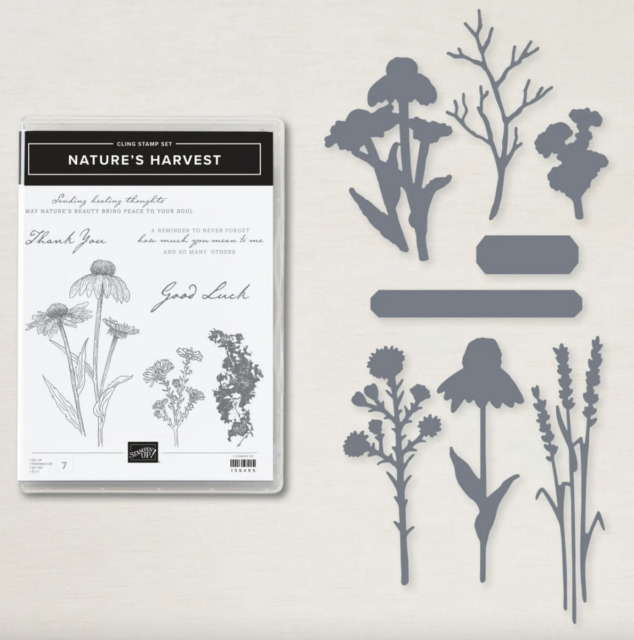
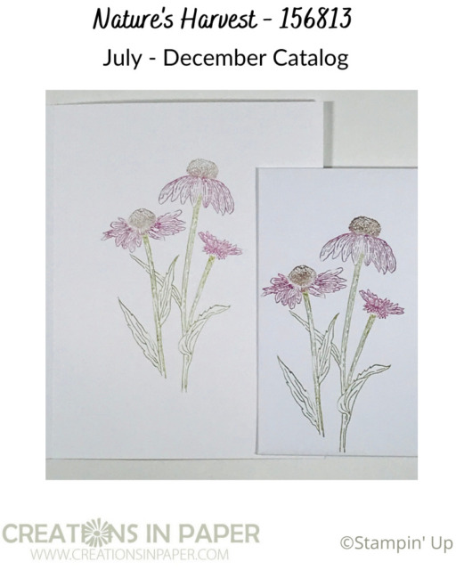
I love the coneflower image in Nature’s Harvest. I had them at my house in Maryland and loved seeing them show off their gorgeous color. Because of that I reach for this set a lot just so I can use the coneflower image. Check out this idea that uses a cool color combination.


We have been using the colors of Fall for our color combinations. Today let’s look at warm versus cool colors.
Color can be classified as warm or cool. Warm colors — such as red, yellow, and orange; evoke warmth because they remind us of things like the sun or fire. Cool colors — such as blue, green, and purple (violet); evoke a cool feeling because they remind us of things like water or grass. You can use this information to come up with color combinations for your cards.
Check this video to see how I use the cool Regals for my color combination.
Looking at your colors as warm or cool is a great starting point when choosing colors. Using the 3 colors that are considered cool colors is a great way to start.
Here are the details so you can use them to make your version of my card.
Measurements
Card base: White – 5 1/2″ x 8 1/2″ scored at 4 1/4″
Background Layer: Misty Moonlight – 4″ x 5 1/4″
Harvest Meadow pattern paper: 3 3/4″ x 5″
Image panel: 2 3/8″ x 3 3/4″
Image panel layer: Rich Razzleberry 2 1/4″ x 3 1/2″
Don’t forget to decorate the inside of your card and your envelope. Here is what I did.

I have used this image on other cards. Check out this idea that reminds me of Black Eyed Susan’s. Did you see this great fall card using leaves for another Fall idea?
Products used for today’s card
Product ListAre you enjoying the color combo series? Leave me a comment and let me know what you struggle with when choosing colors for your cards. I hope today’s Let’s Look at Warm versus Cool Colors gives you some other information you can use when choosing your colors for your cards. Thanks for visiting and have a Fabulous Weekend!


